Tab标签页与Select选择框
Tab标签页

大致就是这种效果
最开始尝试过去找原生的成型代码,但是因为插件一系列问题没有成功,于是开始自己写……
1
2
3
4
5
6
7
8
9
10
11
12
13
14
15
16
17
18
19
20
21
22
23
24
25
26
27
28
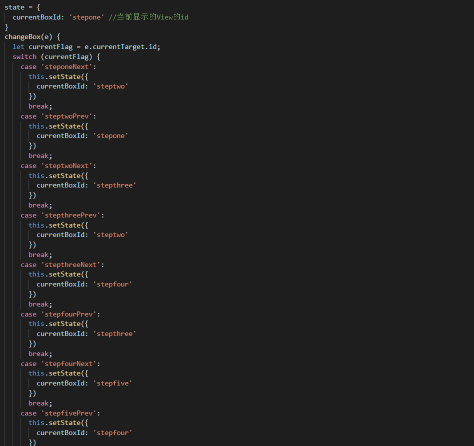
state = {
currentBoxId: 'stepone' //当前显示的View的id
}
changeBox(e) {
let currentFlag = e.currentTarget.id;
switch (currentFlag) {
case 'steponeNext':
this.setState({
currentBoxId: 'stepone'
})
break;
case 'steptwoNext':
this.setState({
currentBoxId: 'steptwo'
})
break;
case 'stepthreeNext':
this.setState({
currentBoxId: 'stepthree'
})
break;
case 'stepfourNext':
this.setState({
currentBoxId: 'stepfour'
})
break;
}
}
正文部分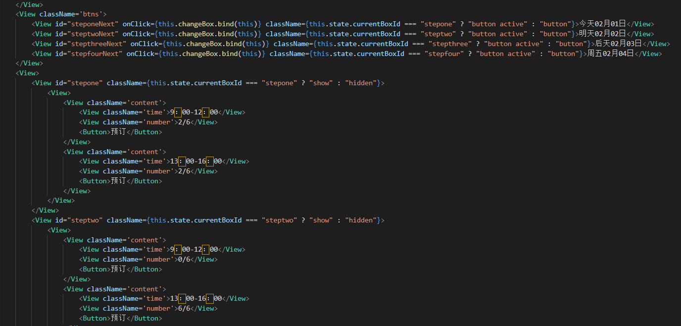
这其实是受到写赚圈圈时上一步下一步页面的启发(复制粘贴过来删除了一部分,但这个命名就懒得换了)
好的,让我们看看上一步下一步的写法
原理大致都是一样的,当点击不同的按钮,改变状态,跳转到不同的地方
Select选择框
html中有select写法,可以直接写出来下拉选择框。小程序原生虽然有Picker写法,但是效果不是这样的。
正文部分
1
2
3
4
5
6
7
8
9
10
11
12
13
14
15
16
17
18
19
20
21
22
23
24
25
26
27
28
29
30
<View className='picker'>
<View className='select teshu' onClick={this.openone.bind(this)}>
<Text>时长</Text>
<Image src='../images/down.png' alt=''></Image>
<View className={this.state.show? "show" : "hidden"}>
<View> 2-4h</View>
<View> 半天</View>
<View> 全天</View>
</View>
</View>
<View className='select teshu' onClick={this.opentwo.bind(this)}>
<Text>难度</Text>
<Image src='../images/down.png' alt=''></Image>
<View className={this.state.modal? "show" : "hidden"}>
<View> 简单</View>
<View> 中等</View>
<View> 困难</View>
</View>
</View>
<View className='select teshu' onClick={this.openthree.bind(this)}>
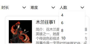
<Text>人数</Text>
<Image src='../images/down.png' alt=''></Image>
<View className={this.state.showmodal? "show" : "hidden"}>
<View> 4</View>
<View> 6</View>
<View> 8</View>
<View> 10</View>
</View>
</View>
</View>
渲染部分
1
2
3
4
5
6
7
8
9
10
11
12
13
14
15
16
17
18
19
20
21
22
23
24
25
26
27
28
29
30
31
32
33
34
35
36
37
38
39
40
41
42
43
44
45
46
47
48
49
50
51
52
53
54
55
56
57
state = { show: false , modal: false , showmodal: false}
componentWillMount() { }
componentDidMount() { }
componentWillUnmount() { }
componentDidShow() { }
componentDidHide() { }
openone () {
const {show} = this.state
switch (show) {
case false:
this.setState({
show: true
})
break;
case true:
this.setState({
show: false
})
break;
}
}
opentwo () {
const {modal} = this.state
switch (modal) {
case false:
this.setState({
modal: true
})
break;
case true:
this.setState({
modal: false
})
break;
}
}
openthree () {
const {showmodal} = this.state
switch (showmodal) {
case false:
this.setState({
showmodal: true
})
break;
case true:
this.setState({
showmodal: false
})
break;
}
}
css部分
1
2
3
4
5
6
7
8
9
10
11
12
13
14
15
16
17
18
19
20
21
22
23
24
25
26
27
28
29
30
31
32
33
.picker {
display: flex;
}
.select {
width: 200px;
height: 60px;
line-height: 60px;
background-color: #fff;
margin-left: 20px;
padding-left: 7px;
}
.teshu {
position: relative;
}
.select Image {
float: right;
margin-top: 7px;
width: 50px;
height: 50px;
}
.show {
position: absolute;
top: 60px;
left: 0;
width: 200px;
box-shadow: 0 2px 10px rgba(0, 0, 0,0.1);
}
.show View {
background-color: #fff;
}
.hidden {
display: none;
}
用了showmodal的方法,用的时候显示,不用的时候隐藏(这种方法也可以使用在弹窗之类的地方)